
The Advantage of Having Your Own Technical Analysis of the Market.
Nasdaq 100 ETF (QQQ)
Chart Setup – Daily & 4-Hour

Over the years of trying different trading systems and seeing how others manage their portfolios, I’ve developed a sense of what indicators work in various market situations and trading Styles. Here, I want to give you an overview and basic structure of the chart setup I use. From intraday trading the E-Mini futures contracts to longer term swing trading, the chart setup is the same.
What will change are Time Frames, Aggregation Styles, Candlestick Types, and the Number of Charts you need for any particular trading Style.
All the technical analysis indicators and chart configurations I’m using were developed from everything I learned from many different people, using systems of all shapes and sizes. What I also learned was that none of the individual systems or indicators worked very well on their own. I always had to combine the knowledge I gained from different sources to make sense of what I was doing.
The important point here is: No matter who Your Trading Partners are, you’ll have a chart you understand that will give you a benchmark to evaluate anything you come across.
Just as a reminder, the chart and the indicators are there as a guide. Even though they sometimes look like a system, they’re not. There has to be an underlying reason for making a trade, based on technical or fundamental analysis or both, and then the chart and indicators come into play to reflect the activity in the market and pinpoint entry and exit points for that trade.
There are so many different trading systems around and more indicators than you know what to do with that it’s very important to focus on a few that you know very well, so you can concentrate on managing the Styles of trading and the specific Methods you have in your Wealth Building Plan. This goes for selecting trading and education services, too. It’s better to work with a few good services and learn how to manage those than continually trying new offerings hoping to find that perfect one – which, you’ll find, doesn’t exist.
Never try to find one trading system to fulfill all your goals, because no system works all the time in a market that is forever changing its personality; so, diversify your trading Styles, Methods, and Services to give you that edge over the market and consistently grow your account.
All the basic variables to the chart setup I mentioned above will come into play as you fine-tune your charts to match the Style of trading and Method you’re managing. Depending on what you’re trading, you may never have to use all the variations – the simpler, the better. At this point, I just want to make you aware that these variables exist:
- Time Frames – Multiple Time Frame (Fractal) Analysis, the study and comparison of different time segments (monthly, weekly, daily, hourly and by the minute), allows the trader to see market activity at different levels to get a better perspective of market direction and manage entry and exit points with more accuracy. For example, in longer-term swing trading, you might use the Daily chart for the initial signal to enter a trade and then use the 4-Hour or even the 1-Hour chart to time the entry with more precision.
- Aggregation Styles – This refers to the data that is contained within each “bar” on a chart. The one most often used is Time, such as a 5 Minute chart, where each bar represents data collected over the five minutes of elapsed time. The next one is by Tick, which is a volume metric, where each bar represents a certain number of ticks (volume) for the instrument in question. The last one is Range, where each bar is set to a price range that the underlying has to exceed before printing the next bar. This can be viewed as a volatility measure.
- Candlestick Types – Here you have a choice, depending on how you look at the market. A significant number of traders use Japanese Candlestick patterns to analyze market direction and when to enter and exit trades. In this case, you would use regular candlesticks made up of the Open, High, Low, and Closing price for each bar, representing a specific time period, tick volume, or price range. Pattern analysis is an extensive study in itself and can be very subjective, depending on who’s doing the analyzing. To me, as an example, it’s akin to Elliot Wave analysis, where it’s very hard to identify a pattern as it is evolving. In trading, timing is everything, and the delay in identifying specific moves can and does limit performance. For that reason, I’ve converted to using Heikin-Ashi candlesticks that give you a much clearer picture of potential market turning points and are excellent at identifying trends. They filter out a lot of the “noise” in the markets, which makes identifying entry and exit points much easier and less confusing. By using the Open/Close data from the prior period and the Open/High/Low/Close of the current period, the resulting combination candlestick produces that enhanced performance. Take a look at the example below:
Nasdaq 100 ETF (QQQ) Comparison
Standard vs. Heikin Ashi Candlestick Charts


- Number of Charts – Considering the importance of Multiple Time Frame Analysis, two charts in different time frames is minimum for longer-term swing trading, and four charts would be enough for the shorter-term trades. I tried using six charts for trading the E-Minis, but it was so confusing that I cut it back to four – two Tick charts, one Time chart, and one chart using Range bars. The number of charts you use will depend on your involvement in the trading process. At this point the choice becomes your personal preference as you gain control over managing your wealth. Only if you end up trading on your own would the higher level of complexity come into play.
The chart below has all the studies I use except for the Relative Strength Index and Support and Resistance points or levels, which can be a later addition to the mix as you get comfortable with your own management style. It looks like a lot to put on one chart, but, as you get used to the indicators and see them work with actual trades, your eye will pick up just the right moves when you need them. Get to know each indicator well and understand what it‘s supposed to do, and “the rest is history”, as the saying goes.
If you’re just beginning to learn about trading and managing your wealth, look at this as a point of reference and what you can look forward to as you learn more and more about Technical Analysis and managing your financial future. I use the TDAmeritrade “thinkorswim” platform, so you may have to do some research if you’re using other products. I’m not teaching you how to setup the chart on any particular platform (could do that later, if needed); I’m showing you the concepts and metrics I use to evaluate market activity.
Nasdaq 100 ETF (QQQ)
Chart Setup – Daily
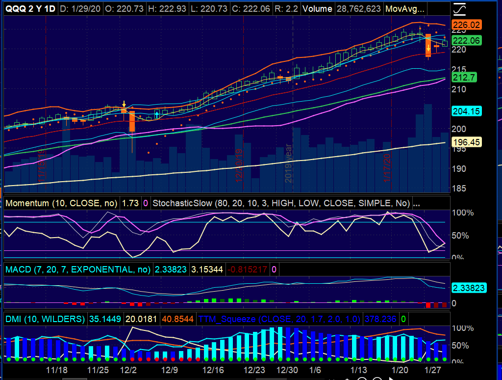
You’ll see in the lower panel section that I’ve overlapped studies. This gives me a better visual depiction of the degree of correlation or symmetry between indicators. What I like about this setup is that the combination of indicators make market personality changes very visible and keeps you from getting stuck in a trade too long, way passed the best exit point. Entry points also show up earlier.
THE INDICATORS
Upper Panel
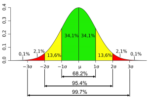
Bollinger Bands – In the early 1980’s John Bollinger created his signature technical trading tool, which has become one of the most popular tools in the world of technical analysis. It is made up of enveloping bands around a 20 period Exponential Moving Average, two Standard Deviations away. Based on the Closing price of each bar, over 95% of activity will be confined within the bands; so, any move outside the bands signifies an abnormal behavior pattern and could signal a change in direction. Other variations can be used, but this construction is the most popular.
The width of the bands shows the price volatility inherent in the underlying security – widening bands relate to higher volatility and narrowing bands to lower volatility. Also, as the price of the underlying approaches the upper band, the more overbought the security becomes, and, conversely, as the price approaches the lower band, the more oversold the security becomes. In the chart above, look for the Upper Band as the thick red line, the Lower Band the thick purple line, and the Exponential Moving Average as the thin red line in the middle of the bands.
Exponential Moving Averages – Because so many people look at moving averages, I include the two most popular ones as reference. Moving averages on their own don’t really tell you anything, and I don’t use them in trading, except to know what others might be doing. The institutional marketplace seems to focus on the 200-Day and the 50-Day moving averages; so, being aware of them is helpful. Whether you use the Exponential or the Simple moving average, you’ll have the same advantage. I lean towards the Exponential Moving Average, because it emphasizes current activity and seems to be preferred by the professional crowd. The 200-Day Exponential Moving Average is in Yellow and the 50-Day in Green.
Keltner Channels – Very much like Bollinger Bands in their application, Keltner Channels are also a measure of volatility with decision points being made at the upper and lower channels, highlighting overbought and oversold conditions. I have them on my chart together to gauge the difference between the two studies, because Keltner Channels use the Average True Range metric to determine the width of the two channels, as opposed to Standard Deviation with Bollinger Bands, so the difference becomes significant. Similarly, the Keltner Channels use the 20 period Exponential Moving Average, based on the Closing price of each bar, to calculate the distance between the channels, but this time based on the Average True Range. This difference between the indicators gives you the distinctive difference that the comparison provides.
My purpose is to see when volatility hits a critical low point. When the Bollinger Bands go inside the Keltner Channels, it signals a period of consolidation leading to a significant breakout when volatility is regained.
The “TTM Squeeze” indicator, which I discuss below, is what I use to alert me to when this phenomenon occurs, and it gives me, along with the other indicators, a very precise entry and exit point. The variable in all of this is the Factor used to calculate the distance of the Keltner Channels from the moving average. The default Factor is 1.5 and is the most common one used. I found using 1.7 increased the incidence of positive alerts and, especially with ETFs, gave more action points. ETFs, being groups of securities, tend to be less responsive to the “Squeeze”. Depending on what market you’re dealing with, the Factor can be adjusted to meet the needs of the trading plan. The Keltner Channels are in light blue, with the Exponential Moving Average the thin red line between them. The TTM Squeeze indicator is shown in the lower studies with the DMI group as light green and red dots along the bottom of the display. The red dots signify the consolidation period, when the Bollinger Bands go inside the Keltner Channels.
Parabolic SAR (Stop And Reverse) – Created by Welles Wilder in the late 1970s, this technical indicator is very popular among traders for analyzing trends and identifying possible reversal points, as the name suggests. This is my early warning signal to alert me that something may be changing in the market. The indicator is structured to be sensitive to “time in a trade” and will continually get closer to price as momentum falls, which can prepare you for a change in direction, lower volatility, or a period of consolidation. Parabolic SAR is represented by “red dots” above or below price. The dots are below price in an uptrend and above price in a downtrend. A trend change may be in the offing when the dots switch from above to below and vice versa.
The indicator is very sensitive to volatile price changes and will whipsaw in a consolidating or directionless market; so, any “early warning” should be taken in conjunction with other management tools for confirmation.
I use an Acceleration Factor of 0.12 and an Acceleration Limit of 0.2 to smooth out as much of the volatility as possible. Another use for the indicator is as a “stop” placement mechanism. If the price exceeds one of the dots, you may want to close the trade, since a change in direction could be signaled. Again, I use it as an early warning of a change in direction, not for initiating a trade without confirmation.
Person’s Pivot Study (PPS) – John Person created this study as a Bullish/Bearish momentum indicator, and I found that the calculations he used produced the best pivot analyzing tool I had ever used. Never has it given me a double reading in the same direction without a reversing reading in between and can be used in any chart configuration. It’s great for momentum change confirmation, and, as a result, it will help reduce the number of bad trades based on false signals from other indicators. Consequently, I use his pivot indicator in all my trade decisions for entry and exit points, along with occasionally using it as the originating motivation for the trade. The momentum pivot points are very specific, with Bullish changes indicated by a “light blue arrow” and Bearish changes indicated by a “yellow arrow”.
THE INDICATORS
Lower Panel
Section 1
Slow Stochastic – One of the popular Oscillator indicators created by Dr. George Lane in the late 1950s to show overbought and oversold conditions in the market. Based on his observation that at market peaks and troughs the closing prices tended to be at the period range extremes, he created the Slow Stochastic to show turning points in the market through the change in two averages oscillating between 0 and 100 (%K and %D) and crossing support and resistance levels. I use the following:
Overbought (Resistance) – 80
Oversold (Support) – 20
K Period – 10 or 14
D Period – 3
Using the Simple Moving Average in the calculations, the market is Overbought when both averages are above 80 and Oversold when they are below 20 (the light blue horizontal lines). Turning points occur when the %K line (white) crosses the %D line (purple) in the extreme zones and continue to cross the resistance or support lines. However, this isn’t an exact science. The market can be overbought or oversold longer than one expects, creating false signals along the way; so, I use the Stochastic Oscillator only in conjunction with other indicators.
Momentum – Measures the velocity of price change over a specified period of time. In my case, I use a period of 10 based on the closing price of each bar to match the Slow Stochastic K Period. If you use a K Period of 14 for the Slow Stochastic, use the same period for Momentum. Considering the limitations of the Slow Stochastic, using Momentum to confirm or negate its signals is another helpful measure. Both of these indicators are only used as part of an overall management process. I look for relative strength between Slow Stochastic and Momentum and when Momentum crosses the Zero line. The Momentum indicator is Yellow, with the Zero line in Purple. The right-side scale (0 to 100) is for the Slow Stochastic.
Section 2
Moving Average Convergence/Divergence (MACD) – As a momentum indicator, the MACD is generally used to signal a change in trend. Two Exponential Moving Averages based on a short length and a longer length are used to create the value of MACD, and then another moving average is used to create a “signal” line to show crossover points where the trend is changing.
Being above or below the “zero line” is significant for evaluating momentum extremes.
When the MACD crosses above the signal line, a bullish scenario is established and vice versa. I like to take bullish trades when the MACD is below zero and bearish trades when the MACD is above zero. This is a general “rule of thumb”, and circumstances will dictate when to deviate. For instance, ETFs are less volatile than individual stocks, and shorter-term bullish trades could present themselves even when MACD is positive, depending on the level of momentum. Again, this is not a stand-alone indicator and should be used as part of a larger management process.
Here’s one of the instances where having experience with different trading systems has paid dividends. One of systems was using MACD as an integral part of the decision-making process and had a totally different configuration than what is default on most other systems. An inherent problem with MACD is that the use of moving averages make it a lagging indicator, and this system compensated for that by using a much more responsive setup. Here are the settings, along with the default, for the Exponential Moving Averages:
Fast (short) Length: Default – 12/Revised – 7
Slow (long) Length: Default – 26/Revised – 20
Signal Line Length: Default – 9/Revised – 7
The Revised settings have made the MACD line (Blue) and the Signal line (Beige) much more useful in determining trend and, most importantly, entry and exit points. The Histogram shows the difference between the two lines and the crossover points at the zero line.
Section 3
Directional Movement Index (DMI) – Another indicator set developed by Welles Wilder and, as the name suggests, shows trend direction and strength. Using a period length of 10 and Wilder’s averaging technique, the DMI is made up of three plots:
- Plus Directional Indicator (DI+) – The average increase of the High Prices divided by the Average True Range (ATR) x 100. No increase or decrease = 0.
- Minus Directional Indicator (DI-) – The average decrease of Low Prices divided by the Average True Range (ATR) x 100. No decrease or increase = 0.
- Average Directional Index (ADX) – The calculated average of the components of the Directional Indicators. This is non-directional and shows the Strength of the trend.
If there ever was an indicator that looked like a system, this is it. When DI+ (light Blue) is above DI- (Beige), price momentum is Bullish, and, when DI- is above DI+, price momentum is Bearish. With ADX showing the strength of the move, trades can be entered at the DI+/DI- crossover point when ADX is showing a strong trend developing by moving above 20 (more conservative traders use 25). The nice part is that ADX readings below 20 indicate no trend or consolidation and keep you out of choppy markets. I look at ADX readings of 50 or above as an exhaustion area and possible reversal point.
The period length and averaging method can be changed to suit different trading styles and markets.
TTM Squeeze – Developed by John Carter for various trading platforms, it measures the relationship between the Bollinger Bands and the Keltner Channels to find exceptionally low volatility areas that signify consolidation before a breakout. I learned about the Squeeze from one of John’s classes a number of years ago and have used it ever since as one of my main indicators for initiating a trade. The indicator set also has a momentum Histogram to give direction to the Squeeze breakout. I’ve found that the built-in histogram has a tendency to lag the move, so I use the MACD momentum histogram more often than not. The settings for the Bollinger Bands and the Keltner Channels used in the Squeeze are the same as above, using the Closing Price of each bar, namely:
Period Length – 20
Keltner Channel Factor – 1.7
Standard Deviations – 2.0
The “Alert Line” is set to 1.0 and indicates that the width of the Bollinger Bands and the Keltner Channels are the same, triggering the indicator. The Squeeze is represented by “dots” along the zero line and are either light green or red. The dots turn red when the Bollinger Bands go inside the Keltner Channels as volatility declines and turn light green when they exit as volatility increases. The thing I like about this specific indicator is it takes the guess work out of interpreting the lines on the chart – the formula handles all the variations. You don’t even need the studies on the chart unless you use them for other purposes. I like them on the chart to visualize extreme moves showing overbought and oversold conditions.
A Great Way to Start Looking at Charts with a Purpose
To more success,

Ted Bliss
Your Research & Development Coordinator
TheDiversifiedTrader.com
The Road Ahead
- Everyone has their own way of looking at charts, and I found having my own configuration helped a lot in evaluating what others are doing. Please leave a comment below, and let me know if this setup will help you in managing your Wealth Building Plan.
- If you’re still wondering why all this matters, you can start on the path to controlling your financial future by understanding that You Really Can Manage Your Own Money and, by extension, your financial well-being.
March 15, 2016 @ 8:01 am
That’s very pretty! How am I to understand it’s significance? Is there a description somewhere?
Lots of love, T
March 15, 2016 @ 10:49 am
Hi Catherine:
Thanks for noticing the chart. As I build my mission to help people take control of their financial future, this chart will become a significant tool in managing the details of your wealth building plan. Right now The Diversified Trader is developing, and the details of how to use the chart will be coming along with the other pieces of the puzzle. For the moment, take a look at “The Rest of My Mission” to get a feel for the direction I’m taking and where you may be able to take advantage of my mission in your own life.
To Your Success, Ted
The Rest of My Mission